The Cut Book (minor case study)
Overview
The Cutbook is a fictional mobile app concept designed to streamline the appointment booking process for service-based professionals—starting with barbers. Instead of relying on calls or texts, which often interrupt the barber’s workflow or go unanswered, The Cutbook offers a centralized, intuitive way for clients to view availability, book appointments, communicate, and eventually make payments—all from their mobile device.
This case study explores the end-to-end design process, from research to high-fidelity prototyping, with a focus on designing a simple, effective solution that addresses both user and stakeholder pain points.


Role & Responsibilities
As the sole product designer on this project, I was responsible for:
Conducting user and stakeholder interviews
Synthesizing insights into design decisions
Creating wireframes and high-fidelity mockups
Prototyping and testing
Iterating based on user feedback
Problem Framing
The Challenge:
Barbers often rely on direct communication to manage appointments, which can be time-consuming, disruptive, and inefficient. Missed calls can translate into missed clients—and missed income. Likewise, clients may experience frustration when trying to schedule time, especially when their preferred barber is hard to reach.
The Opportunity:
Design a lightweight, intuitive system that allows clients to view a barber’s availability and book appointments on their own time—without back-and-forth messaging. The app should also allow for future features like messaging, feedback, and payments.
Discovery & Research
To better understand pain points on both ends of the experience, I conducted casual but focused interviews with a local barber and several of his clients. I spent a half day observing and asking questions as appointments were being handled manually.
Stakeholder Interview Themes:
“How do you manage your schedule day to day?”
“Do calls during sessions interrupt your flow?”
“How often do you miss messages or appointment requests?”
“If you had a digital appointment book, what features would matter most?”
Client Interview Themes:
“How do you typically book appointments today?”
“What happens if you can’t reach your barber?”
“How often do you get your haircut each month?”
“Would you be comfortable booking via an app?”
The insights confirmed the need for a simple, self-serve solution that reduces friction on both sides while staying lightweight and accessible.
Approach
I applied the Lean UX methodology to move quickly through ideation, prototyping, and testing—focusing on solving the core problem first, rather than building out a fully-featured product.
Think
Defined the problem by understanding both barber and client needs. Mapped goals, expectations, and key touchpoints of the current appointment workflow.
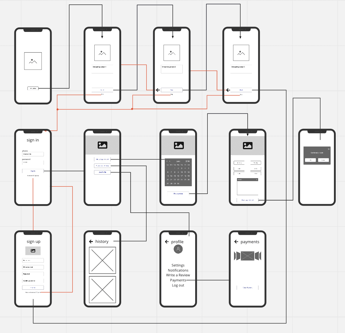
Make
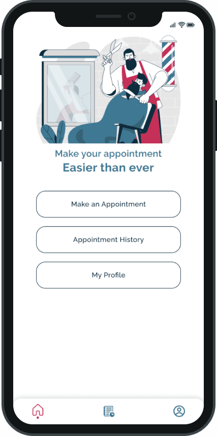
Sketched wireframes to capture essential screens: availability, appointment details, and confirmation. Built low-fidelity prototypes to test layout and flow. The priority was clarity, speed, and minimizing cognitive load.
Check
Tested the prototype with three regular clients of the stakeholder over two weekends. Collected direct feedback on usability, ease of navigation, and clarity of key actions. Iterated based on common points of confusion and requests.

Design Execution
The Cutbook experience was designed to be intuitive and minimal, prioritizing core actions over excess functionality.
Key Design Decisions:
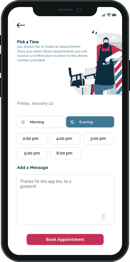
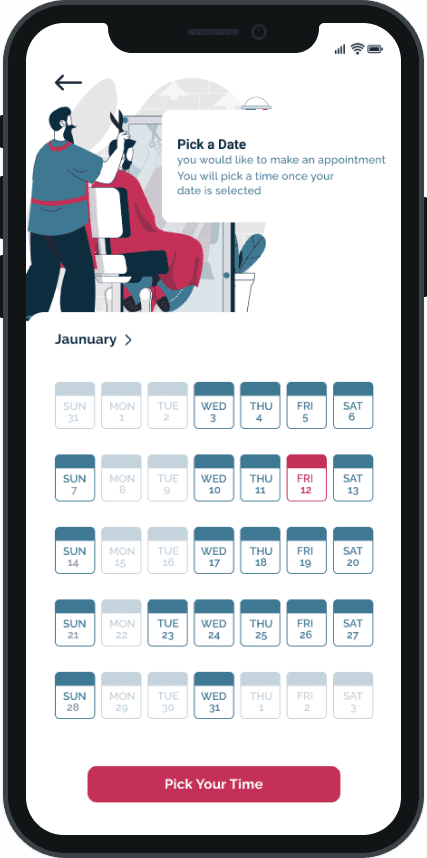
Streamlined appointment booking: Clients could select a time slot in two taps. No unnecessary input fields.
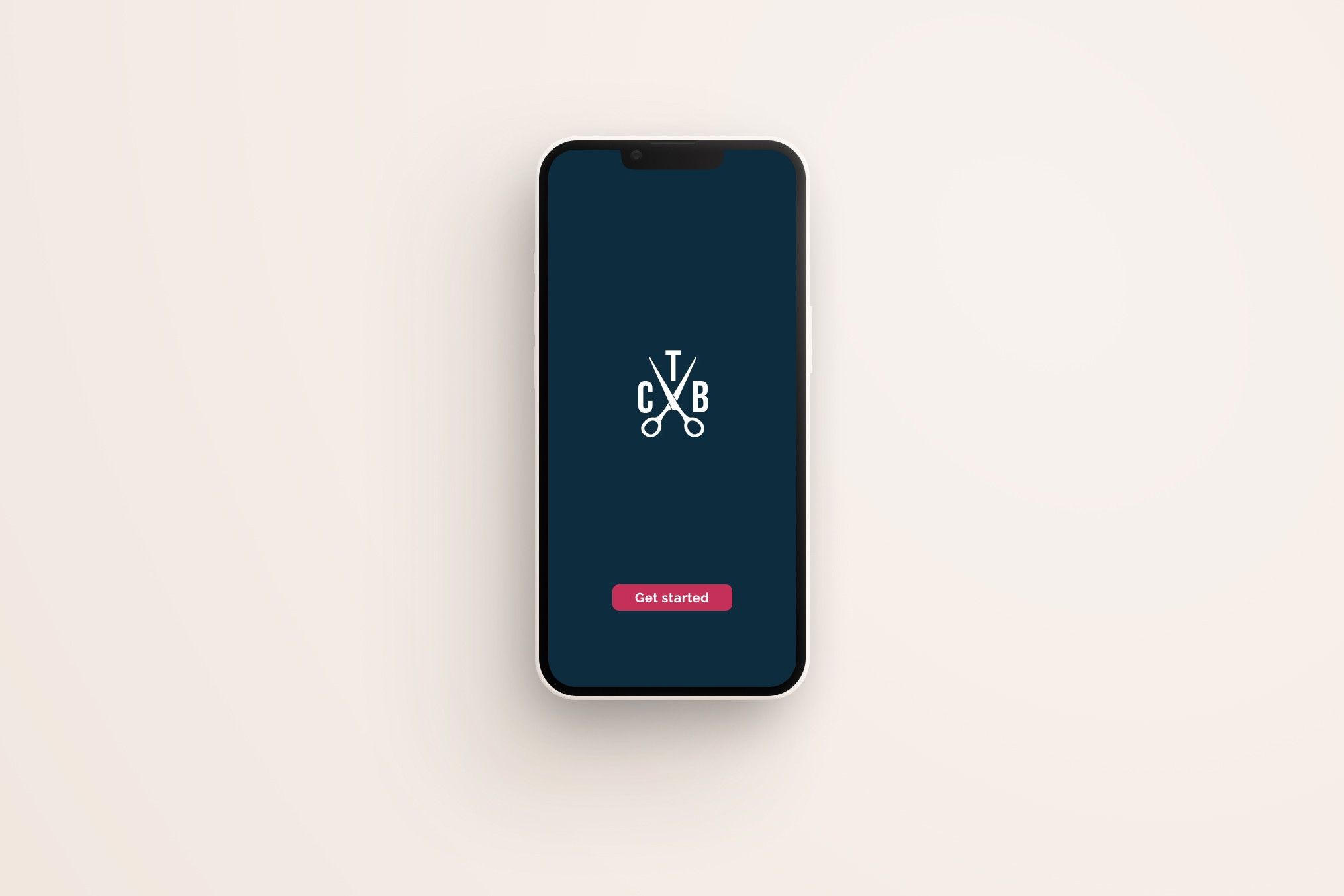
Onboarding-less interaction: Users could immediately begin booking without creating an account first.
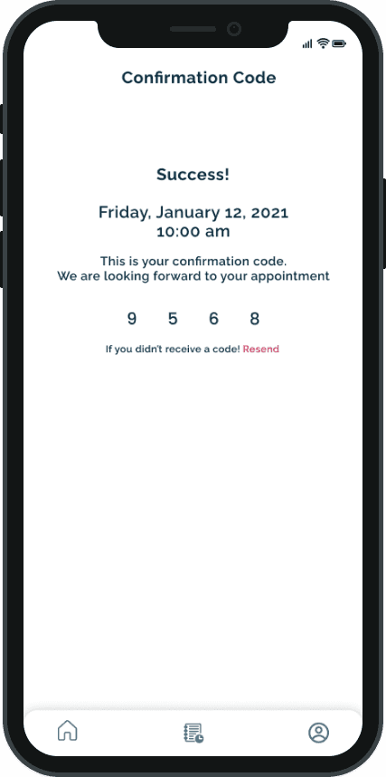
Smart confirmation: A code sent via SMS was automatically detected by the app, saving time and effort.
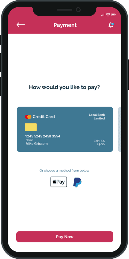
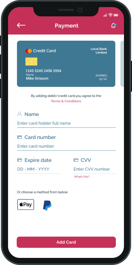
Scalable for future features: Messaging, payment, and reviews were considered in the information architecture for future implementation.
Design Deliverables:
Information architecture and user flows
Wireframes (Miro)
High-fidelity mockups (Figma)
Style guide with UI components and interaction patterns
Clickable prototype for user testing (InVision)
Outcome
The feedback from initial user testing validated the approach. Users described the product as simple, efficient, and intuitive. A notable UX win was keeping the user within the app for confirmation—leveraging the device’s ability to autofill codes from SMS, improving the flow and minimizing drop-off.
While the MVP addressed the core scheduling problem effectively, future iterations will explore integrated payments and broader scheduling features for other service-based professionals.
The project is currently on hold pending stakeholder approval and resource alignment.

Reflection
Designing The Cutbook was a great exercise in solving a focused problem with just enough design. By staying lean and user-centered, I was able to validate key assumptions quickly and iterate based on real feedback. The process reinforced the importance of designing with constraints, prioritizing clarity, and building with the future in mind—even for a fictional product.